Transformation Tuesday: Saddlebrook
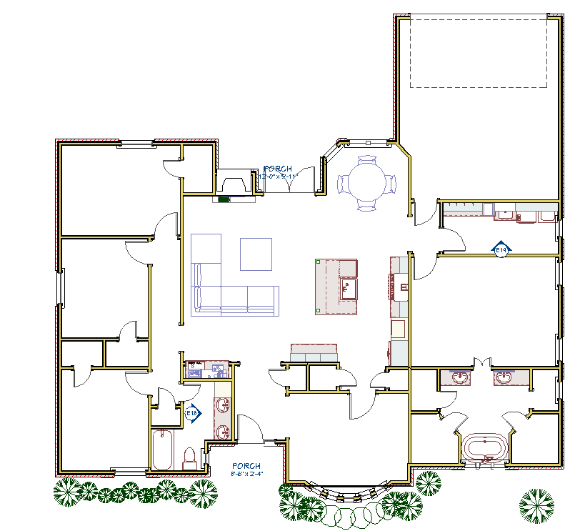
The Plan
The Transformation
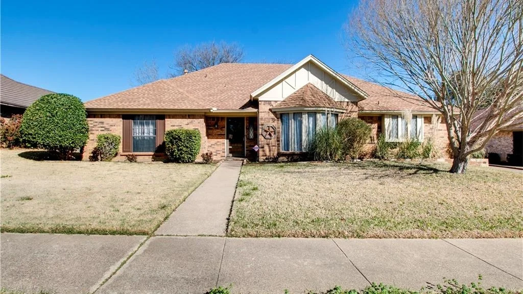
before: front elevation
Before, this home was really starting to show its age. These first-time homeowner newlyweds saw the potential in this home. They asked for a cozy farmhouse look and an open concept floor plan. They were on a budget, but this major transformation proves that with the right plan (and the right help) you can create a space that fits your family's needs and your personality.
Before: entry
Before: this entryway was odd and asymmetrical. The door was off-center and ran you directly into the foyer table! And the window pattern made it feel more like prison than home.
After: A bright and beautiful mahogany entry centers the door and allows in more light without compromising privacy. This entryway really says, "Welcome home" . Stain color Duraseal Fruitwood.
Before: guest bath
Before: country chic....minus the chic. Check out those clam shell sinks!
After: Behr Paint Color NYPD Blue, in honor of the homeowner's father who served 25 years for DPD. Chrome fixtures and hardware with the Thassos marble brighten up the space beautifully and this hexagon porcelain tile was a great find! You can catch a glimpse of simple subway tile in the mirror's reflection for the tub surround. This bathroom proves the right choices go a long way (for less)!
Before: Master bath
Before: I mean, its not THAT bad, I've definitely seen worse, but what is up with those curtains? The shower had been newly renovated, so we tried to salvage what we could while creating a space that expressed the homeowner's style and made it feel "theirs"
before: master bath
After: We married the existing beige tile and the new bright white with a simple accent that tied in both colors for a simple and inexpensive update to the newly renovated shower. Farmhouse fixtures and a clawfoot tub completed the look. Off-centered sinks allow for more drawer and counter space.
Stay tuned for part 2: the kitchen and bar reveal.


