Tried and True Paint colors
Welcome!
If you have found your way here, I am so glad you did! After much pressuring from my very tech savvy mother and way too many clients for way too long, I have started a blog. My hope is that this will become an easy place for current clients to find answers to their questions, a place for potential clients to get an idea about who I am and what I do, and for lovers of beautiful spaces to find real, professional advice for home building and renovation whether they plan to DIY or hire a pro. I am a licensed contractor and Realtor with 10 hard-fought years of experience in buying, renovating, building, beautifying and repairing homes in the DFW area. Like most in this industry, I am mostly self taught with guidance from a bunch of really great old guys; inspectors, architects, draftsmen, electricians, plumbers and other pros. My husband and I have spent the last decade learning absolutely everything we could about home building and renovation and how to do it RIGHT. We've learned a lot about the difference between doing it right, doing it cheap, where to save, when to spend and when NOT to do it yourself.
For my first post I thought I would start with one of the questions I am asked most frequently as a designer/builder/realtor, "What color should I paint..." So, as a welcome to my blog, here they are, my most used, most loved, no fail, tried and true paint colors. I use Benjamin Moore colors for a broad variety of reasons, so many in fact that I decided to save that for another post. (I don't exclusively use Benjamin Moore paint in every application, but like I said, another post) With a little patience and tweaking you can get a good match in any brand of paint. Depending on the resin and pigment of the specific brand of paint you are using, you may not be able to achieve the same depth of color, especially on some of the darker colors, but for the grays and whites you should be able to get close enough should you decide to use a product other than Ben-Moore. So let's get started!
One Size Fits All-Over color
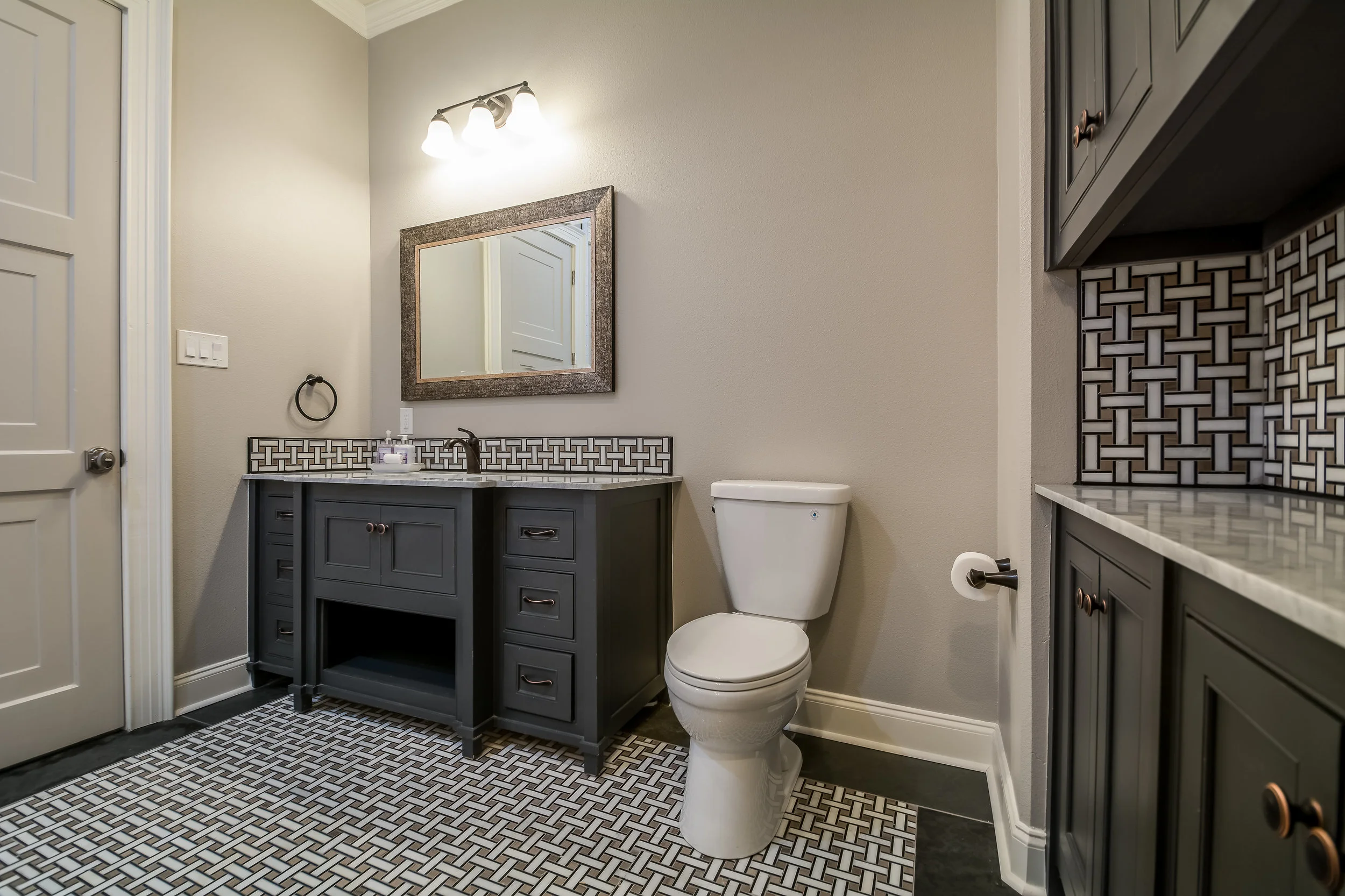
These are warm, live-able grays, perfect for family rooms and bedrooms. Cumulus Cloud and Pashmina I like to call "Chameleon Colors" because they look different in every space depending on the amount of natural light, and they seem to always match. Light Pewter and Classic Gray are almost white grays, use only in large areas with lots and lots of natural light when you are trying to achieve a Layered Layered white look.

Light Pewter 1464
Benjamin Moore

Classic Gray 1548
Benjamin Moore

Pashmina AF-100
Benjamin Moore

Cumulus Cloud 1550
Benjamin Moore

Layered whites
Walls: Classic Gray 1548
Trim: Cloud White OC-130
Ceiling: Etiquette AF-50
Cabinets: Edgecomb Gray HC-173
Favorite Blacks
Excellent for Doors, Cabinetry, and anywhere you need a deep dark color. I almost never use a straight black because it can look very flat, I try to use one with a lot of blue and purple pigment to it. Black Beauty is the darkest of these colors with a LRV of only 5. LRV, or Light Reflectance Value, is a measurement commonly used by design professionals—such as architects and interior designers—that expresses the percentage of light reflected from a surface. LRVs range from 0-100, with 100 being pure white and 0 being absolute black.

French Beret 1610
Benjamin Moore
Classic collection

Midnight Oil 1631
Benjamin Moore
Classic Collection

Black Beauty 2128-10
Benjamin Moore
Color Preview
Walls: Cumulus Cloud 1550
Cabinets: French Beret 1610
Door: Edgecomb Gray HC-173
Trim: Cloud White OC-130
Accent Colors
Providence blue is just fun to use as an accent. It is sophisticated and toned down enough not to be juvinile, but bright enough to really draw attention. Kendall charcoal is a great one-size-fits-all dark gray. Use it on anything from exterior trim, to cabinetry, to interior accent walls. Wickham Gray is a lovely blue-gray, perfect for bathrooms and sunrooms.

Providence Blue 1636
Benjamin Moore
Classic Collection

Kendall Charcoal HC-166
Benjamin Moore
Historical Collection

Wickham Gray HC-171
Benjamin Moore
Historical Collection

Providence Blue in a library
For cabinets and trim
My go-to interior white is always Cloud White. Yes, I know White Dove is the number one designer pick, and I love to use it outdoors, its my favorite for painted brick because it just gleams in natural light, but inside it can look a bit yellow especially in incandescent light. For interiors I use Cloud white because no matter the light; natural, incandescent, LED or fluorescent, it gives off just the slightest pearly pink sheen which makes it look so very clean. (Don't think pink like 1970's mauve, more like the iridescence of an actual pearl)
Real oil paint yellows over time, and although we usually use a non-yellowing Alkyd nowadays, you have to steer clear of yellow tones in your whites lest they look too aged.
One of my new favorite whites was actually Benjamin Moore's color of the year for 2016, Simply White OC-117. It has the brightness of White Dove without the yellowness. Maybe a bit too white for walls in my opinion, but great for Cabinets in an All-White kitchen.
Edgecomb Gray is one of my favs for cabinetry, doors and millwork. It blends perfectly with cooler grays on walls and tones down bright whites.

White Dove OC-17
Benjamin Moore

Cloud White OC-130
Benjamin Moore

Simply White OC-117
Benjamin Moore

Edgecomb Gray HC-173
Benjamin Moore
Historical Collection

Simply White OC-117 Cabinets

Cloud White OC-130 Trim and Walls

Edgecomb Gray HC-173 Cabinets
Last but not least,
Ceiling color
I have used this same color on almost all of my projects in the last 5 years. Etiquette from Benjamin Moore's Affinity collection. The Affinity Collection is a deck of 80 colors specifically formulated to match every.other.color in the entire deck. Seriously, fool proof color selection. While colors in this deck tend to be a bit too dark for recent trends, all of the colors in this deck have enough pigment variety that they will match pretty much anything. Pashmina AF-100 is also from the Affinity collection, which explains why it can look both cool and warm, gray or taupe, depending on the space.

Etiquette AF-50
Benjamin Moore
Affinity Collection